I have not failed. I’ve just found 10,000 ways that won’t work. ~Thomas, Thomas Edison Edison: His Life and Inventions. F. L. Dyer and T. C. Martin 1910
A Mind Map for an Interactive Navigation
At the start of each year, I take a decent amount of time to review my goals and ambitions. One idea that has always intrigued me is visualizing my thoughts. I did a bit of casual searching around the internet and started to form this idea in my head.
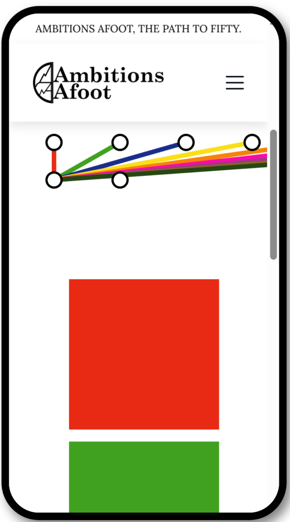
I wanted to show my journey in a visual way that was more than just a list of blog posts and to show the interconnectedness of the goals and ambitions that make up A.D.V.E.N.T.U.R.E. Searching around the internet would lead me to settle on something with a mind map feel. There were a lot of different types, but at the time, I was spending a lot of my free time watching model train videos. This led me to think back to when I lived in the D.C. area for a while and rode the metro. I had the idea to create a train layout for the D.C. area, but that topic is another day.
What is important is the metro map of the trains that service the D.C. metro area. That colorful map is easy to read and allows you to understand where you are while in transit. As I searched for other metro maps, I became fixated on the idea of visually representing my blog posts to resemble metro train stations on a map.
Their simplicity attracted me; they seemed like a great way to show how my blog posts could be interconnected. There was this great interactive visual in my head that would help guide the reader to key blog posts grouped together correctly. However, what wasn’t clear was how to show the progression of blog posts through time. After sitting on the idea for a few days, it occurred to me that I could just have the stations flow downwards from a central node to show progression over time.
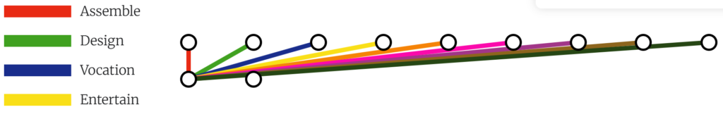
I had enough of an idea that I knew the end goal was to create an understandable visual that required little to no explanation to the viewers. It would need to show all nine A.D.V.E.N.T.U.R.E. categories with corresponding colors. The categories needed multiple connections to merge and break away to other nodes. Each node would represent a blog post and link to it.
An Attempt
My first attempt was absmole in trying to use shapes to create a metro style map. I tried to create this visual idea with an online editor in Hostingers web builder but the results were just not promising. I was getting really weird renderings on different screen sizes while elements would appear in random places. I’m sure this had something to do with the placement and z-level of these elements.
It looked even worse in mobile view. Try as I might, I couldn’t get it to act responsive in the way that my mind had imagined it would. I ended up trying a number of other things to get this to work, but in the end, it didn’t. I recognized that I was on the wrong path and needed help to find the right direction.
Asking for Help
It was probably due to the fact that it has been a few years since I really sat down and studied the current landscape of modern web building. Let alone tried to write code. There was a lot that I just didn’t know any more. So, after some Google’ing, I gave up and reached out to an old colleege and friend who runs VISUI.
We discussed what I was trying to do via text and after a few volleys back and forth he suggested I give d3.js a try. While I do use A.I. for a lot of things on this project and in other aspects of Ambitions Afoot, there is also a lot of human interaction and discussions behind these goals. I see A.I. as a great tool for filling in details, creating base content, learning, brainstorming, and proof reading.
Previously I had asked ChatGPT for some examples.
What are some examples in which to show a visual map of blog posts with various categories?
It responded with a mind map style, category wheel, geographic heatmap, timeline or progression flow, process or decision tree, tag cloud, or world map. None of these captured my imagination and attention. I had looked around at a bunch of different solutions that the train station idea started to form. It also helped that I was watching a ton of YouTube model train videos for another goal that I haven’t committed to yet. Never underestimate the power of letting your mind wander and imagine.
There is just something about speaking to another human that helps get the creative juices flowing, and with a bit of guidance on his end, it was a huge motivational boost! A huge thanks goes out to him for taking some time out of his busy schedule to help with that thought process.
Feeling a renewed sense of motivation, I ventured into the world of d3.js. I quickly realized that I was slightly out of my depth, but not completely. While I had ChatGPT to assist me, I still needed guidance on the best path to take.
Running with d3.js and Leaning On A.I.
I had my starting point, an idea of a real-world visual image that I wanted to recreate. I had my end goal, a metro-style map linking to blog posts. Now, all I needed to do was connect the dots.
After reviewing all the different visualizations that d3.js offered, I narrowed down the ones that I wanted to try. I used ChatGPT again, starting with basic prompts to create content that I could copy to my website and gain a visual idea of how it would work.
I started with a d3.js tidy tree, but that was mostly because ChatGPT created that for me. Luckily, long ago I embraced the idea of working in iterations because nothing in perfect the first time. That’s a mindset that I find to be very helpful when working with A.I.!
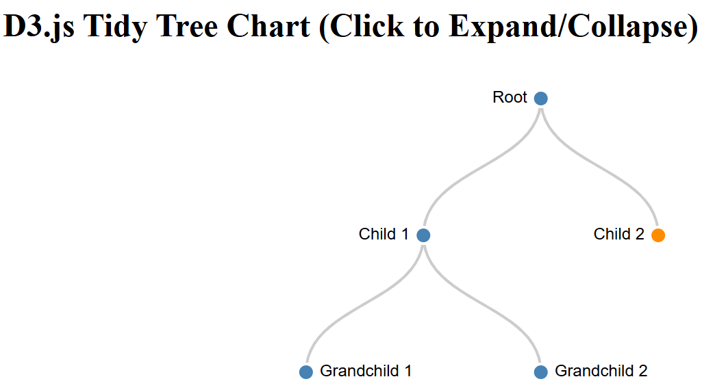
The first tidy tree was neat, but it was no metro map. I started by slowly asking ChatGPT to make changes to the code base. First I added random colors to each branch. Then I started to add the total number of starting stations and the unique colors for each branch. Adding a bit of text alignment and I thought I was off to a good start.
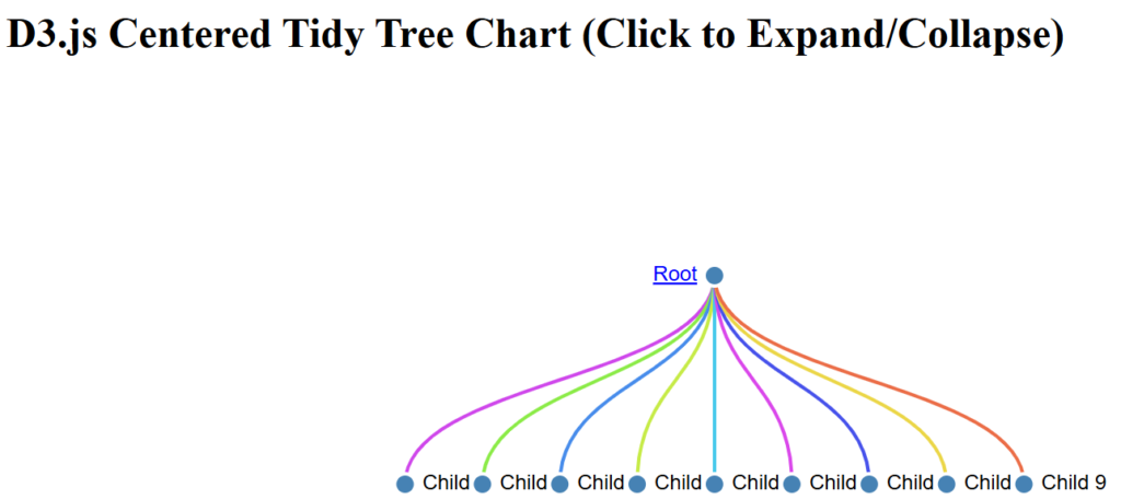


What may not be obvious is that I was also prompting to correct the behavior of the chart. I had to prompt for the children of the root element to be always visible and for the grandchildren nodes to not be visible from the start. There was also an issue with the expanding and contracting behavior only working some of the time.
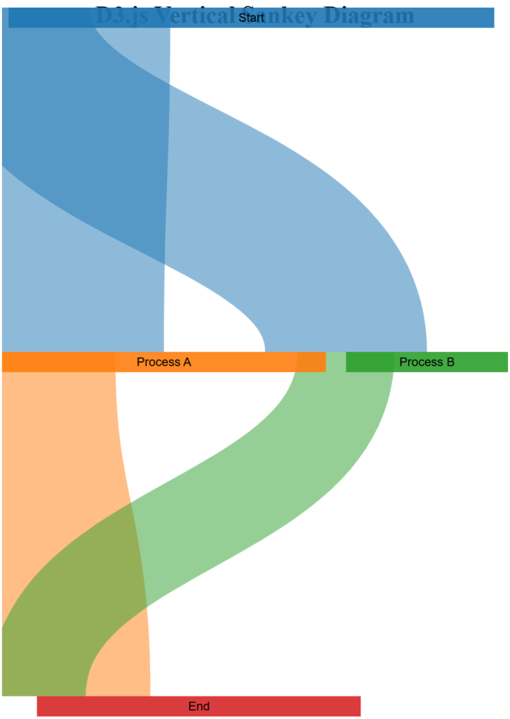
The tidy tree might have potential in creating a metro like map, but out of the box it just wasn’t what I was looking for. Looking around I tried a Sankey chart with mixed results to get it vertical.
At this point, I didn’t give up but I definitely moved on. To review all of my prompts and output to this point, see the following ChatGPT conversation: Embed D3.js on Hostinger.
Exploring Other d3.js Charts in A.I.
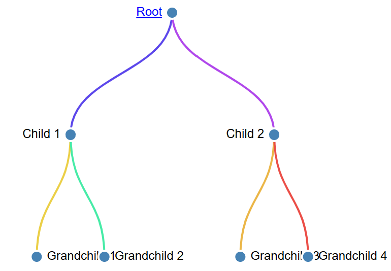
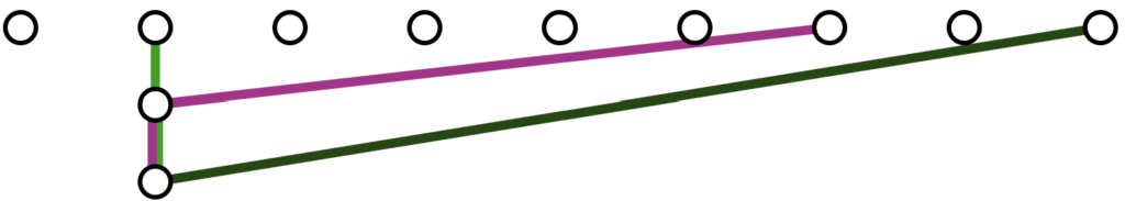
Another chart type that I tried was a DAG chart type from d3.js. This seemed promising but after a number of errors I moved on.


A force directed network map might have worked. However, it didn’t match the metro map feel that I was working towards.

I didn’t spend as much time on these visualizations as they didn’t seem to match what I was looking for to begin with. I did spend some time to search around the internet for others who might have come close to doing what I was working towards, but nothing really jumped out at me to actually work as I wanted.
It was at this time that I realized that these charts had a potential flaw with how I was going to use them. The parent-child relationship was going to give me issues further along. All but the force directed chart would only allow each parent node to have multiple children. A parent node could not share a child from another parent node.
I’d have to put some thought into this and approach it from a different angle. To review all of my prompts and output to this point, see the following ChatGPT conversation: D3.js DAG Collapsible Chart.
Reset and Try, Try, Try Again
It didn’t seem to me that d3.js was going to be the correct path forward. Searching around the internet, there really didn’t seem like anything would be a good start without a lot of debugging of older code. Frankly, it seemed like more work than it was worth. It was at this point I took more than a few days to think about this.
A few weeks later, I circled back to this and tried again with what I thought to be a better prompt, and I was not disappointed!
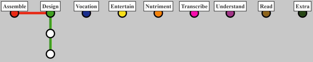
Code a javascript visual showing an interactive metro train system map. There should be nine train lines and at least ten stations, two with multiple train lines at the same station.

This prompt created a SVG element that is powered by JavaScript and as you can see, looks a bit more like a metro map to start with. It also solved the issue of having one child with many parents as well. The code powering this is acting more like a map as the nodes are just points that can be connected to each other in any way. I did play around with this initial example for a while to understand what it could do and where I would need to improve it.
The following prompts were used to add additional functionality to the map with promising outputs.
If two train lines share a path between two stations, then the corresponding train line colors should be next to each other.
For the following code, how would I add visual titles to each node?

Since this generated code was easy to follow and ChatGPT had kindly provided code comments I did update the code myself, then add it back into ChatGPT with further instructions. It was useful to keep three or four files that held the last working code to enable testing changes without losing previous progress. Maybe a future project will spur me to use GitHub?
Once I had updated the code, I would feed it back to continue with prompts to future refine the end product to what I had envissioned.
Update the code that was just provided to allow for the stations to be equally spaced horizontally based on the width of the parent element.
Make the station names bold and place the name in a white box with a black boarder.
Set station A, B, C, and D to always show their names and fill with a solid color.
Where line elements share the same path between stations, they should have equal width.
If there are two or more different lines poinitng a station, a second circle should show around the first.

If a station has a hidden name, place the name at a 45 degree angle to the top right of the station with a smaller font. These stations should have no box and no white background.
Remove the rectangle from all stations. Leave the rectangle on stations A-D.

As you can see, it really started to turn out to look like a train station map of metro stations. I was really happy with how this was turning out and continued to mix my time between ChatGPT and manually editing the code to fine-tune where stations would appear and the names of those stations.
I took some time to focus on the placement of the starting stations to ensure that they were evenly spaced and had proper titles that were understandable as the starting stations. Within the code, I also made a number of comments about where new stations could be placed depending on the length of their blog title.
Additionally, I spent a lot of time getting the colors to match the physical colors that these categories in A.D.V.E.N.T.U.R.E. map to. I physically write about these ambitions that I have and color code them so that I’m able to quickly know which ambition that has been written about. For my own sake, it’s important that the colors match both in the digital landscape and the physical world.
o review all of my prompts and output for this last section, see the following ChatGPT conversation: Interactive Metro Map.
Check out the end result here: The A.D.V.E.N.T.U.R.E. Path.
Ultimately, I like what I have created with the assistance of A.I. (ChatGPT); it was an excellent tool for this little project. By far, it was less than perfect but helpful! I hope that you have enjoyed this walk-through of prompt engineering and that you have found it to be beneficial in your endeavors!